

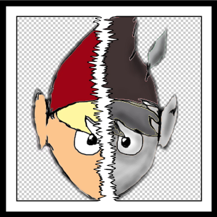
These two images are shots from my music video. I originally planned to choses and feature one of them for the front cover and one from the back because, when researching album covers and digi-paks, there is always a sense of continuity, coherence and a relationship between the specific images chosen. I was working with images I had taken screen shots of when I realised I could go back to my original images and position them in a different way. Previously, I had produced the exact same image of the character in two contrasting styles so the idea of using both to create such a disparity was a design which could be done in many different ways, rather than keeping it simple and residing to one image which could potentially be more uninteresting. However, this concept did create much more of a challenge.
 I began by drawing a jagged line down the centre of the page with a very thin, horizontal paint brush tool. Then, using blending options, I created an outline to make the shape more definite.
I added two separate borders to frame and enhance the image. The first image I added onto a new layer was a close up of the black and white character. I placed the head in the centre of the frame so the line would run directly down the middle of his face.


I then positioned the other colour image over this one and used the eraser tool on full opacity to remove one side of the face. I used the same technique to add the backgrounds - this just meant rearranging the layers on Photoshop so the main subject lays on top of the background instead of the other way round.


I designed the band name and format with a colour contrast to fit with the split cover. I duplicated the text and positioned it underneath with a lighter opacity rate. I did this again to make it look like it is fading away. I found this a nicer technique than changing the blending options of the text - when researching, I found the name of the band is normally presented more subtly than the name of the album. I then added the text 'feel to follow' after the single of the album. I changed the font and colour to create a contrast and make the album as a whole an independent product for the style of the band name can be the same on all their future products but the style of the album name will always change. I felt this font in particular fitted with the chilled out style of the music.


