 For the backdrop, I decided to use this image I produced in Photoshop, originally for the music video. I chose this bearing in mind the continuity aspect. The colour scheme of the majority of my video is in shades of black, white and grey. So when producing the digipak, I did not want to disregard this decision I had thought about so early on in the production of my portfolio. However, I had to adapt the image for my advert for it was originally a landscape setting for a scene in my animated music video so I had to position each layer in a way which would not detract from the main feature of the advertisement, yet still look effective. I used the eraser tool in Photoshop with a low flow rate to produce the hazy moon effect. Having the position of the moon in centre frame would look unnatural and unrealisitic whereas having it to one side would unbalance the layout of the page so finding that equilibium was a matter I had not seen to be potentially problematic when I planned the design of my magazine advertisement.
 I pulled the jpg file of the CD front cover onto a new layer. Having the cover of the album appear on the advert is an important factor I have gathered from my research into this field. I enlarged and centred the image to make it a prominent feature.
Next, I added the title of the band. There must be a clear distinction between the band name and the album title. The band name usually has it's own seperable font and format to the album name. So the font and colour scheme chosen for the band name on the album cover is the same as the title on the magazine advert. Having one word in black and one in colour relates to the chosen layout of the album cover with a definite distinction between two sets.
The sign next to the title has been drawn free-hand with a fine paint brush in Photoshop, then duplicated and flipped to have the design on either side of the band name. I added this feature to make the text stand out even more and could also be used later in other productions, almost like an iconic logo for the band.


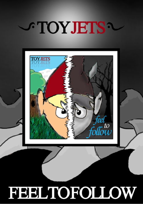
The title of the album is in bold and capitals, different to how it is presented on the album cover. This decision was down to the fact that the white contrasts perfectly with black and therefore is more dynamic.
Having the text 'out now' in capitals is a common trait when advertising a product which is new on the market. This is done so people are aware that it has already been released and available to purchase. I added an inner shadow and outer glow to give the text some texture so it is less plain. The light blue colour of the writing relates to the title of the album on the album cover.

